The Dr. Wilbert J. McKeachie Poster Competition
The goal of this competition is to expand the potential of the academic poster and to explore ways to make the poster session into a more active learning experience for both presenters and participants. To achieve this goal we seek poster submissions in both the traditional (paper) and non-traditional (multimedia or other) form, but which explore innovative approaches to the poster medium. Whether traditional or non-traditional, we encourage poster presentations which engage viewers, encouraging interaction with the content, the presenters, and other audience members. Creating an effective, exciting, interactive poster presentation is more difficult than it may appear. We encourage you to consider the following as you work your poster magic:
Poster Judging Criteria
- Conceptual Depth and Content - The posters originality, conceptual basis, and the relevance and value of its content.
- Clarity - The posters success in communicating a message effectively.
- Design - The posters visual design and use of images and diagrams to effectively reinforce the themes and concepts explored in the poster. The posters use of text does not exceed what is easily readable in this setting.
- Potential for Engagement - The posters potential to foster active learning. We encourage designs which foster greater and varied interaction between viewer and presenter.
- Select your theme carefully. Choose a title which inspires curiousity: think of your poster as a billboard advertisement to draw people to your presentation.
- Select background colours which complement the colours of text, pictures, and graphs. Dark text on a light background is easiest to read. Contrast is the key to easy visibility for both images and print. Also, stay away from backgrounds which are busy or distracting.
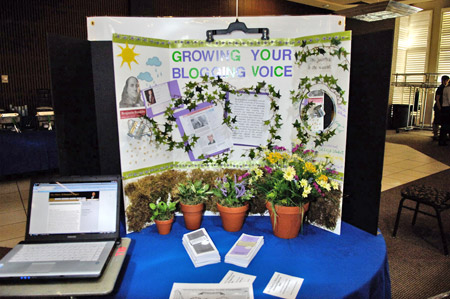
- Use images to communicate in order to limit text as much as possible. When using text, be concise and accurate.
- Beware of bulletitis! Countless, highly bulleted poster and multimedia presentations have proven effective in helping millions of viewers to catch up on their sleep. In an active learning approach to poster design, details should generally be reserved for handouts.
- Less is more. Use a few really good images and succinct blocks of text. Make them large and easily legible and lay them out on the poster so they lead the viewer on a journey through your content. Use blank space to give the eyes and the mind an opportunity to rest and absorb the information you present.
- Do not let the medium get in the way of a good message! Concentrate on effectively communicating your message: for example, text should be easily readable from a distance of two meters (6 ft.). Calligraphic and ornate fonts can be distracting and difficult to read: serif and sanserif fonts are generally more advisable.
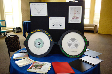
- Make your poster interactive. Find a novel way to make you viewers interact with the material, even if only to add their suggestions or comments on sticky notes. If they interact with the content, they have to think about it, which will promote better memory of it. Some examples from past poster presentations include innovative uses of sticky notes, laminated posters with spaces for wet-erase marker notes, matching activities, Velcro attachments, etc.
- Handouts providing further detail can enhance the information in your presentation. One approach is for your poster to display content subheadings, while the handouts use those subheadings to provide more information.
- Rehearse a short (2-3 minute) introduction that includes an ice-breaker for the viewers that your presentation attracts. An engaging question might get them talking, for example.
- Remember to have pencils and a sheet of paper, for those who want to leave an email address in order to have more information sent to them. Bring plenty of business cards, and plan a place to put the business cards you collect from those who are interested in your presentation. Sending thank you emails to them after the conference will help cement good relationships.
Traditional Poster Production
Microsoft PowerPoint is a superb poster production program. This is not to suggest that you simply create a slew of slides, mount them side by side on a page and print it off.
To produce a poster using PowerPoint, a single slide frame is used as a page onto which you position your images, graphics, and text. Begin by selecting an orientation for the page (landscape or portrait), then inputting the final dimensions of your poster. Both of these options are found using: File/Page Setup. Our poster presentation boards have a horizontal dimension of the poster can be no more than 48 (122 cm) and the vertical dimension no more than 36 (91 cm). This should dictate the size of your poster.
You can include images, text boxes, and graphs just as you would if you were making a slide for a presentation rather than a poster. A professional printer can take your PowerPoint file and print it to the size poster you specified above. The results are amazingly good. Posters can also be laminated, especially if you intend to use them more than once.
Details about creating a poster using PowerPoint can be found at: How to Make a Poster Using PowerPoint.
Download a University of Windsor poster template.
Download an Oakland University poster template.
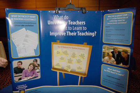
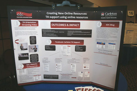
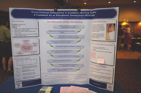
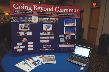
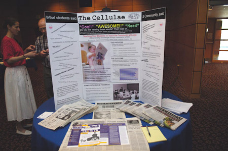
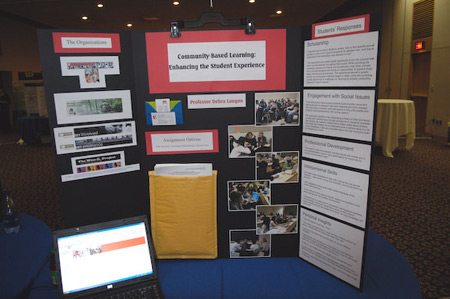
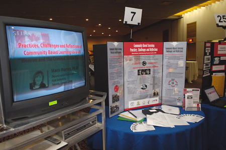
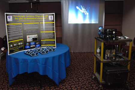
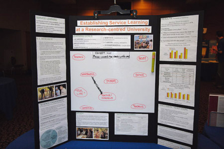
Poster Examples
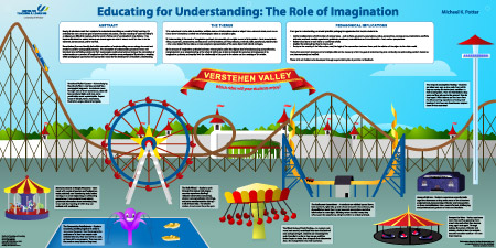
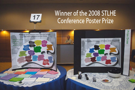
The 2009 Dr. Wilbert J. McKeachie International Poster Prize Winner prize was awarded to Michael Potter of the University of Windsor’s Centre for Teaching and Learning, for his poster “Education for Understanding: The Role of Imagination.”